An isoline map is a map, chart, or graph that connects points of equal
value. This isoline map shows the average water amount for winter wheat irrigation for successive years in China.
A continuousy variable proportional circle map uses a variety of sizes of circles in order to illustrate data. The size of the circles are proportional in the data that was measured. This example is of the electorial college votes for the 2012 Presidential election.
A planimetric map is a map that represents only the horizontal positions of features. These maps are used for neighborhoods and detailed maps. This is a map of a neighborhood in North Carolina.
A mental map is made from a person's point of view or perspective. It is an individual's way of looking at something through mapping. This is a mental map that was used for process thinking at Mas Que Un Techo for problem solving.
A statistical map is a special kind of map that shows the variation of data for research or statistics purposes. The map above shows the number of law officers that have had reports of police miscondict for the first six months of 2010.
Dot Distribution maps are a way to represent data through the use of dots. The dots can represent many different variables including population, colleges and airports. This dot distribution map is an example of the population in New York.The size and density of the dots is very important in order for the reader to understand the data.
A classed choropleth map is a map that moves from specific to the general. This is done with groups that have similar values. This classed choropleth map is illustrating the number of deaths under one year of age. The data has similar values to the group.
Hyposemtric map is a map of topography that uses color sequence by filling in the spaces between contours usually with green, yellow, orange and blue. This is a hyposemtric map of the moon.
A hypsometric map is a map that shows the configuration and the height of a land and its surface. This hypsometric map is of the Aral Sea and its surroundings. Mountains, rivers and other land types of show in this type of map.
An isotach map is a line on a map connecting points of equal wind speed. This map is measuring jetstreams in the west and midwest states. It shows the wind speed of these areas.
An isobar map is a map with imaginary line(s) that illustrate the equal barometric pressue. This mpa of the United States shows barometric pressure pattern.
Doppler radar is a radar tracking system that uses the Doppler effect to find the location and velocity of clouds, precipitation, and storms. This is a sample of Doppler radar of Canada.
Infrared photos care made with cameras that are sensitive to certain things like light and use a special kind of filtration. Infrared photos are used by the military and environmentalists among other groups. This is an infrared photo of Sabine Pass, Texas.
A nominal area choropleth map is a type of thematic map that illustrates data. This map
has different colors and patterns to highlight certain areas. This nominal area choropleth map
is the population of the United States from 1990-2000.
A climograph is a graph that illustratates the annual temperature and rainfall of a specific geographic location. One vertical line illustrates temperature and the second shows rainfall. A horizontal line shows the time period. This climograph is the monthly temperature and precipitation of Providence.
A standardized choropleth map is made by coloring geographic features with different shades that can vary and are proportional to the data that is being illustrated. This standardized choropleth map is of the United States population by state. Darker shades are for higher population states while lighter shades are lower population states.
Proportional circle maps are used to show data that is of geographic nature. The symbols, which are usually circles, are proportional in size to the value that is given to each one. This map is of the USA electoral college number of votes per state.
Cartography has used animation in many of the maps. Cartographic animation is the graphics of a map over time and evolves. These maps are very popular with tornadoes, hurricanes and tsunamis. This cartographic animation is of the Asian tsunami.
A univariate cloropleth map is a type of thematic map. It is generally used when only one type of data is being illustrated. The univariate cloropleth map above is of the population in Franch in 1968.
An isopleth is a map using a contour line which connects points that are of equal value. Values can be color coded in order to make it very easy to read. This isopleth is of the annual wet deposition of a region of the United States.
Black and white aerial photos are used for many reasons. Government agencies use them as well as scientists. These photos can be classified by altitude and other factors. This black and white aerial photo is of Paris, Franch.
The cadastral map is a very detailed and popular map of the early 1850s. These maps are from the Public Land Survey System and illustration metrol regions. This map is also from the 1850s and is the metro region of Portland.
A thematic map shows the specific data through spatial distribution. These maps give specific data about specific locations. This thematic map displays the party control of Governors' offices in January 2007.
A topographic map uses contour lines that are drawn on the map to represent all changed in elevation. When looking at this map, you know that you are either climbing uphill or downhill. This topographic map is of a campground.
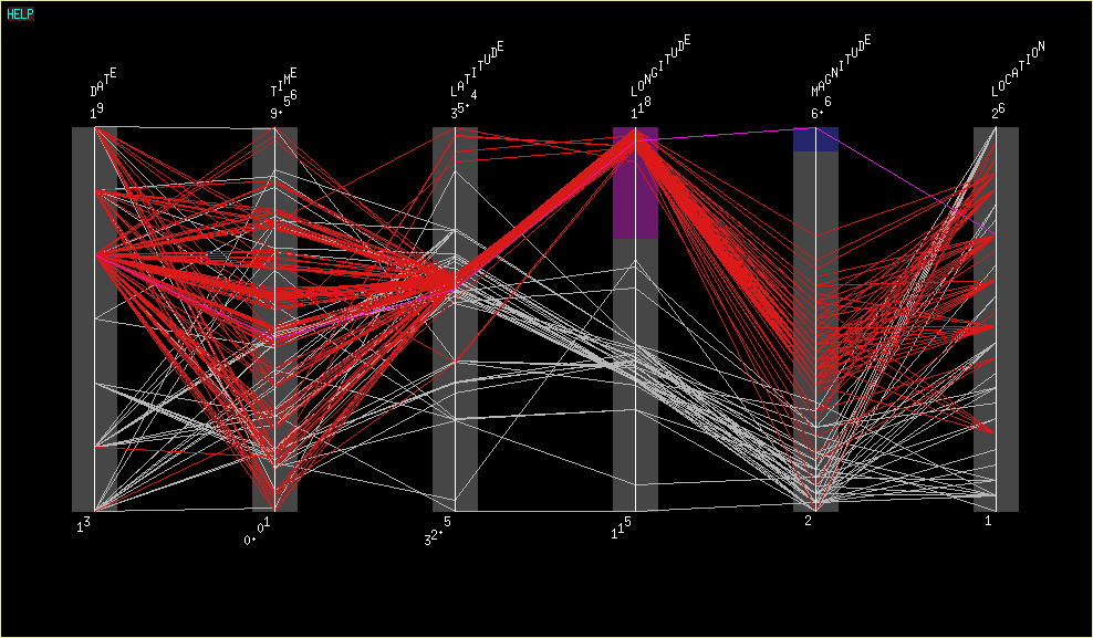
A parallel coordinate graph is a tool to visualize and analyze multivariate data. There are vertical lines as a backdrop to measure the lines of data. This parallel coordinate graph illustrates an earthquake.
A population profile ia a chart showing the number of people that uses their ages as a function of data. This population profile is from the 2010 Census for the District of Columbia. It uses ages and gender to create the profile.
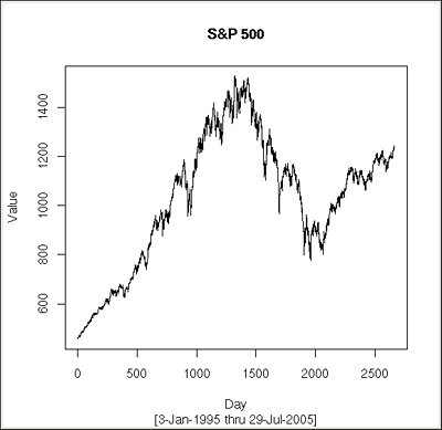
An index value plot is a visualization map. An index value is not an absolute value and is plotted on a line graph. This index value plot is plotting the S&P from January 8, 1995 to July 29, 2005.
A correlation matrix is a matrix that illustrates the correlations between all pairs of data sets in the data. This correlation matrix is shows the correlations between sleep and study.
A similariety matrix is a way to express the similarity between two or more different data points using a matrix. This matrix is of baseball players and their batting averages.
.
An index value plot is a type of visualization map where an index value (not
absolute value) is plotted on a line graph. This type of plot is used for the stock
market because it easily graphs the rise or drop of stocks. This example shows stock from January to September in ARMS.
DEM stands forVisualize Digital Elevation Model. This is a type of 3D visualizion for GIS data that combines several layers of terrian and thematic maps. This map shows many different levels of terrian.
A box plot is a venue to summarize data that is measured on an interval scale. It is generally used in exploratory data analysis. The box plot above shows the distribution of the length of transmissions chaines for various fitness costs.
The DRG map is a Digital Raster Graphics. It is scanner raster images of USGA topographic maps. These types of maps are useful a backdrop for other data to be superimposed. This can be used to check the correctness of a vector file. This map is a DRG of the Depue Island.
An isopach map is a map of the variation of thickness and extent of a stratigraphic unit. This type of map is used for geological purposes. This example of an isopach map is the debris-flow deposit of an area.
Flow maps visualize the movement of different items. These can include people, money, and commodities. This flow maps illustrates importing to the United States and exporting from the United States.
LIDAR stands for Light Detection and Ranging. It uses lasers to measure the distance to or between properties and targets. It is used by the military. This example of LIDAR is from SAIC and is an urban model.
A cartogram is a type of map which focuses on a thematic mapping variable. This variable could be population and travel time. This cartogram is from the University of Michigan and represents the United States Presidential election of 2004.
A bivariate map is a mpa that has two different sets of graphic symbols for informational purposes. This bivariate map shows the median house values and the population in 1997 of a specific area.
A bilateral graph shows different types of data that can be comparied to each other given specific variables. This bilateral graph compaies three Scribner variables with offset of estimation MSE and number of frames.
A topography map shows natural and man made features. It usually is large-scale and shows relief with contour lines. This is the map of an area between Park City and Deer Valley Meadow.
A histograpm is a graphical display of specific data. The data can be grouped into various ranges and then plotted as bars or other symbols or graphics. This is a histogram of a class of students and the final grades.
A star plot map is shaped like a star and has several variables that represent different information. It can be two dimensional and is also called a web chart and radar chart. This map shows the different
spending categories of Company X. It has the actual spending and the alocated budget
A wind rose map is used in meteorology to diagram wind direction and speed over a specific location during a specific period of time. This map illustrates the wind throughout a specific location and also the direction and speed of the wind.
A propaganda map is used to create a certain feeling or emotion. This map was used in World War I to intimidate the French and to make them believe that their country would be taken over by the enemy.
A scatterplot map is a mpa that uses dots or other symbols to display the presence of a variable of data. This map shows the locations of stations throughout the United States.
Range graded proportional circle maps are a group of circles that show different variables. This map shows the number of people who live in communes in Zurich, Switzerland.
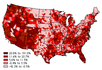
This is a clorepleth map because is uses shading and colors to define certain information on the map. This map shows the one year forecast change in jobs for the 3rd quarter of 2010 vs. the 3rd quarter of 2009.


